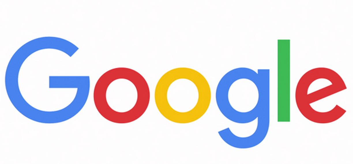
After creating an umbrella company called Alphabet the California-based tech giant Google has unveiled a new logo for its core search services.
The new logo is still a wordmark, but it uses a sans-serif typeface which look much more modern and playful than the old one.

New logo simple and uncluttered
The company said that its new “simple, uncluttered, colorful, friendly” logo better reflects the new ways that people are using Google.
Google is no longer just one site that people visit on a desktop computer. It now has a range of sites, apps, and services that people use not just on PCs, but Chromebooks, smartphones, and tablets.
The new logo can more easily shrink down to appear on smaller screens such as on a smartwatch.
Google is also replacing its tiny “g” logo found on browser tabs with a four-color uppercase “G” that matches the logo.
A company’s logo is a specific design that reflects what the company is all about, i.e., its brand image.
Google said that the logo is designed to combine “the mathematical purity of geometric forms with the child-like simplicity of schoolbook letter printing.”
The company added: “It doesn’t simply tell you that you’re using Google, but also shows you how Google is working for you. For example, new elements like a colorful Google mic help you identify and interact with Google whether you’re talking, tapping or typing. Meanwhile, we’re bidding adieu to the little blue “g” icon and replacing it with a four-color “G” that matches the logo.”

The new Google logo bears more of a resemblance to the logo of its new parent company, Alphabet.

