Are you looking to hire a poster designer? If so, they could make or break your next marketing campaign. But if you hire the wrong designer, your whole campaign could suffer.
In today’s digital-first society, well-designed printed pieces are becoming increasingly important. People will think about a company before they even come in physical contact with it.
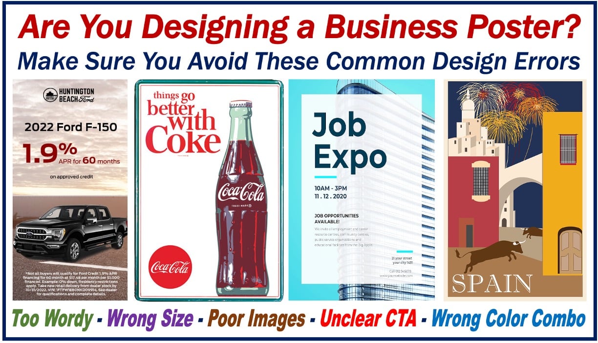
A well-designed printed piece could get them interested in your business. You might want to learn about these business poster design errors before they affect your overall design.
Keep reading!
1. Incorrect Poster Size
One of the most common mistakes businesses make when designing posters is choosing the wrong size. The standard poster size is 18” x 24”, but many businesses choose to use a smaller or larger size depending on their needs.
If you choose a poster size that is too small, your message will be lost in the design, making it more difficult for people to notice. Conversely, if you choose a poster size that is too large, your poster design will be overwhelming and won’t be easy to read.
When in doubt, stick with the standard 18” x 24” size.
2. Poor Quality Images
Chances are, if you’re using free images from the internet for your business poster, they will be low quality. And while you might think that no one will notice, trust us, they will. Blurry, pixelated images will make your poster look unprofessional and rushed, which is the last thing you want.
To avoid this, make sure to use high-quality photos that are relevant to your topic. If you’re not sure where to find these, plenty of stock image websites offer royalty-free photos. Just make sure to double-check the licensing before you use them!
3. Unclear Call to Action
Your call to action should be specific and easy to understand. It should be prominently displayed on your poster so that viewers will know what you want them to do. A common mistake is to have an unclear or confusing call to action.
Always remember to be honest, and stick with your business theme.
4. Too Much Text on Posters
Including too much text is another major and common mistake. This can make your poster look cluttered and difficult for people to read.
Keep the text to a minimum when designing your poster, and use bullet points or short phrases instead of long paragraphs. You should also avoid using small font sizes, making your poster challenging to read from a distance.
5. Bad Color Scheme
The first thing potential customers will notice about your business poster is your color scheme, so you want to ensure it’s on point. A bad color scheme can make your poster look amateurish or make it unappealing to look at.
Here are some tips for avoiding a bad color scheme:
- Stick to a maximum of 3-4 colors
- Colors should complement each other
- Avoid using similar shades of the same color
Avoid These Business Poster Design Errors Today
Posters can be a great way to promote your business, but it’s important to avoid common mistakes in their design. We hope this article has helped you learn about some of the most common business poster design errors and how to avoid them.
With a little planning and attention to detail, you can create poster design ideas to grab attention and get people excited about your business.
Did you find this article helpful? Check out the rest of our blogs!