Have you ever wondered why you feel energized inside a vibrantly colored room? Or why you feel relaxed when in a room filled with lighter colors?
Color affects your life more than you realize. It serves as an effective communication tool and affects everyone on a deeper level to the point that it has been believed to impact behavior and mood.
Even famous artist Pablo Picasso remarked that colors tend to follow changes of emotions, much like features do. This may be why the psychology of color has become an integral part of many artistic niches, including interior design.
Here, you will learn the effect of this design aspect on people’s mood and how you can use that when choosing furniture, fabrics, or wall paint colors in interior design to foster health and productivity.
Color Psychology 101: How Hues Affect Your Mental State
As the name implies, color psychology is a concept that revolves around the idea that exposure to specific colors affects one’s behavior, emotions, and even overall health.
In color theory, black, white, and every color in between can affect how a person acts, thinks, and responds to specific stimuli in their environment. In fact, some studies show that colors have a significant impact on creativity, productivity, and communication inside the workplace.
Some colors also help calm the mind and promote happiness, supporting rest and relaxation in one’s home.
Whether you want to inspire creative thinking, boost employee output, or promote a healthy environment at work or at home, below is a list of colors you should consider and the different effects they have on the human mind:
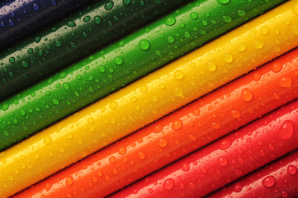
Green
As the primary color of the environment, green is believed to stimulate growth, balance, and restoration in color psychology. Because it immediately brings nature to mind, it effectively encourages unwinding.
However, it also has a certain warmth to it that promotes togetherness and comfort.
Yellow
A warm summer hue, yellow is considered the color of memory. According to color theory, it enhances a person’s attention level through nerve stimulation, making it a good choice for offices and other places that require alertness and focus.
Red
Known to stimulate both mind and body, red is the color you want if you’re after increasing circulation in the body. When used in a room, it leaves people feeling warmer than usual.
It is also the color of passion, energy, and volatility. Because of this, too much red anywhere may lead to undesirable effects.
Red is recommended as an accent in most cases and should be used sparingly to trigger just the right amount of energy inside a room.
Blue
Considered the most popular hue in color psychology, blue has an opposite effect to red when it comes to blood circulation. Aside from decreasing blood pressure, it also slows the heart rate and respiration, making it the most relaxing color in the spectrum.
Lighter tones of blue are more popular for their soothing, calming, and refreshing effect, like the sea and the sky.
Deeper shades are also known to boost confidence and have been linked to ideas like peace, success, loyalty, and trust.
Orange
A combination of emotional yellow and physical red, orange can also stimulate a person’s body and mind. But unlike red, it has a more cheerful effect. Besides representing happiness, orange is also the color of determination.
How to Incorporate Color Psychology in Your Interiors
After understanding the effects of each color, the next step you need to take is to know where and how you can use them in interior design:
Green
Because it combines the warmth of yellow and the invigorating aspect of blue, green can be used anywhere in the house. It is also a good choice for rooms used for rest.
In the office, green can be applied into brainstorming spaces or rooms where people often use computers because it helps rest the eyes.
Of course, you don’t need a purely green wall or ceiling to achieve the desired effects. You can simply decorate with indoor plants to enjoy the benefits of the color, cleanse the air, and bring some positive mojo into your office or home.
Yellow
It is believed that painting the walls behind an office whiteboard yellow would help employees absorb more information presented to them, leading to better productivity.
However, too much yellow can overwhelm the mind, so using this color will be more effective as an accent. Use it in elements like textiles, so be sure to look for a fabric supplier in Dubai with a good number of style choices for this color.
In residential areas, yellow is an excellent color for the kitchen and dining room, as well as bathrooms because of its welcoming and energizing vibe. This is because it is as warm as the sun and evokes positivity.
Red
Red is an excellent choice to accentuate rooms where nighttime work and physical activity are done. It can foster creativity and excite a person when seen in the workplace.
When used in just the right amount, the intensity of red can help raise the energy level in a room. It is also believed to trigger adrenaline, ambition, willpower, and action. This makes it the perfect color to complement your creative spaces and home office.
In the dining and living room, red effectively draws people together and encourages conversation. When used in an entrance hall of a building, it also helps create a powerful impression.
Blue
As it is a calming color, professional interior designers often use blue in bedrooms, bathrooms, and any other room where a relaxing environment is required. Like green, it can also be applied to conference rooms to support detail-oriented brainstorming.
Blue can bring some calmness to an otherwise erratic environment through décor and furniture.
Lighter shades are popular in industries where productivity and focus are needed to accomplish repetitive tasks, like accounting firms. It is also particularly helpful when used in a doctor’s office to help calm down nervous patients.
Orange
Exhaustion at work can be eased by a bit of orange in an office or any other creative space. This color brings the energy and endurance from red but also the cheerfulness of yellow.
Orange can also be used in dining areas to stimulate appetite, but not in conference or brainstorming rooms that require intense focus. It also creates a social atmosphere, which can become counterproductive when you’re looking to boost productivity.
If you don’t want to interrupt your concentration by a sudden urge to eat or socialize, you can still use this hue for productivity by only adding it to complement another color. You can also use it to accentuate the room.
Color, Interior Design, and You
Color plays a critical role in interior design not only for aesthetics’ sake but also to ensure that the room is optimized for whatever purpose it serves. Use this as a guide when deciding on colorful elements in your space.
You may be interested in: 3 Booming Post-Covid Business Sectors