One of the biggest challenges for those who work with design, like photo editor or graphic editor, in general is to keep abreast of market developments and the constant changes that can occur overnight. This involves various factors such as usability, new technology, and the changing tastes of your target audience.
Those who work in the area are familiar with the habit of continually being renewed. According to PicsArt, a collage maker, communication is forever changing, and quickly – if you are not up-to-date regarding new techniques and developments, you may end up launching a relatively weak campaign.
Here are some trends in the graphics market so you don’t lose time and start printing more and more effectively, which will eventually be reversed not only in your work, but in your business numbers.
Dreaded degradation has returned!
Controversial between designers and elements that share opinions, in 2019 the gradient returns with everything. Abandoned in mid-2007 with the advent of flat design today implemented as a complement to flat design 2.0.
Present in the major brands, the composition of its solid colors presents elegance and modernity to today’s graphic design.
Look at an example of what we talked about in a large company logo:
Clear Color Show
You might have noticed that the graphic world is much more colorful lately. Companies are increasingly adopting brighter, brighter, more intense shades that really get attention when someone sees it.
Yellow, red, green and blue are colors that are often used in graphic production.
Strong and Authentic Typography Family
After a minimalist wave where symmetrical, simple, sans serif and strong fonts are used, today the scenario is almost the opposite. Brands look for elements that are related to the essence of the campaign. The source is something that does not escape the concept, we are increasingly accustomed to finding artistic and wasteful sources in certain works.
Asymmetry is a new harmony
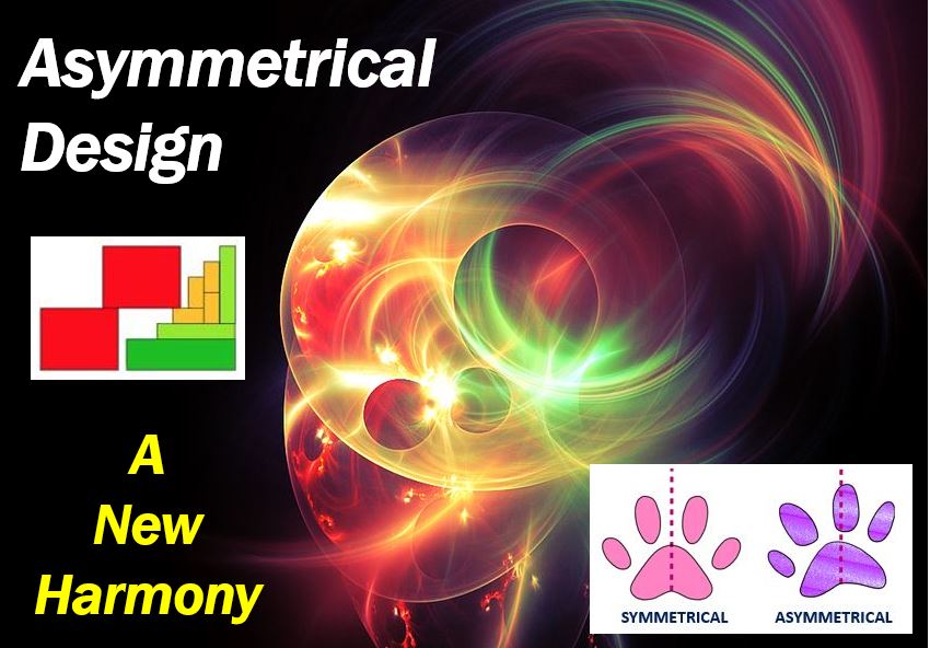
Asymmetrical layout is to distribute elements of art unevenly. The first impression is that it is truly a mess, but if applied with harmony brings a modern, young and super striking air to your message.
This is one element that can make a difference in print because it is likely to be something striking and that arouses one’s curiosity at first contact.
Responsive logo
With the adoption and evolution of technology, your brand must be seen and recognized in various formats in the online or offline world. Thus, designing a brand or even graphic material that is responsive and allows it to be downgraded to a different format can make your company different from competitors and more successful in its communication actions. The use of special tools like collage maker is suggested.
The graphic world doesn’t stop
We increasingly see the weight that graphic and visual elements have in communication. People increasingly look for practicality and relevant material. Competition has increased and today you are fighting for the attention of one person with hundreds of other brands in the same segment.
Both in the offline and online world, following trends and updates is not just a matter of arrogance, but also a necessity, because your brand builds relevance and effective communication actions that really bring results to your business.
______________________________________________________
Interesting related article: “Which professions should know web design basics?“