What do you do first thing in the morning? Check your smartphone for new emails? Well, you’re not alone. As many as 58% of adults have this routine. The advent of smartphones has changed our lives in many ways, not least being the manner in which we consume our emails. At present, approximately 85% of people prefer using their smartphones to access their emails. Now, this makes it imperative for businesses and marketers to optimize their email campaigns for mobile devices. Wondering how you can go about it? You are just at the right place. In this article, we will be sharing with you a host of different tips and tricks that will enable you to craft mobile-friendly emails and responsive email templates without breaking a sweat. Read on to find out!
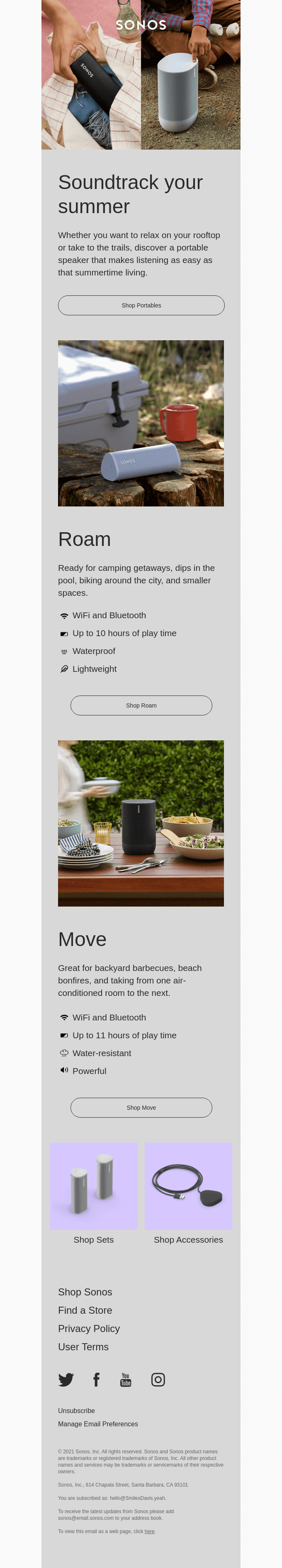
Use Single-column Layouts
When you craft your emails with a multi-column layout, you risk encountering a bevvy of rendering issues across mobile devices like overlapping columns, overflowing text, shifting of images and the like. Besides, it is easier to define the hierarchy of your content in a single-column layout. Subsequently, this makes navigation incredibly convenient for your readers. Single-column layouts also take the cake when it comes to implementing email accessibility. HTML email templates across the globe are, invariably, coded using tables. Now, with tables, it is extremely crucial to be conscious of the content order. The content sequence must, at all times, adhere to the top to bottom and left to right reading order. Should this happen to get overlooked, audiences using assistive technologies like screen readers will not be able to interpret your emails properly.
On the whole, email templates designed with a single-column layout offer great readability. As a result, they fetch excellent interaction and engagement.
Take a look at some delightful single-column layout email examples.
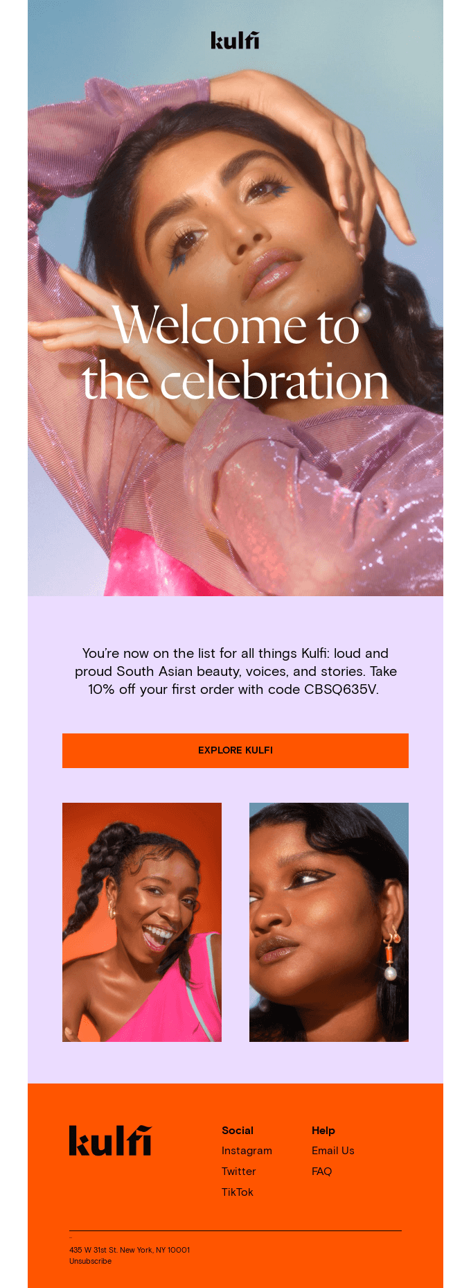
Embrace Brief Copy
If your email has long and winding paragraphs, it will instantly put off your mobile email users. Hence, your email copy should always be crisp and to the point. If at all you have to include more content, make sure that you structure it neatly with the help of headings, subheadings, and bullets to make it presentable for your readers. After all, you wouldn’t expect them to fraternize with big text chunks, would you? Additionally, in this age of dwindling attention spans, a brief copy gives you a better shot at effectively holding your audience’s attention.
Here are some examples that offer a masterclass in writing concise copy.
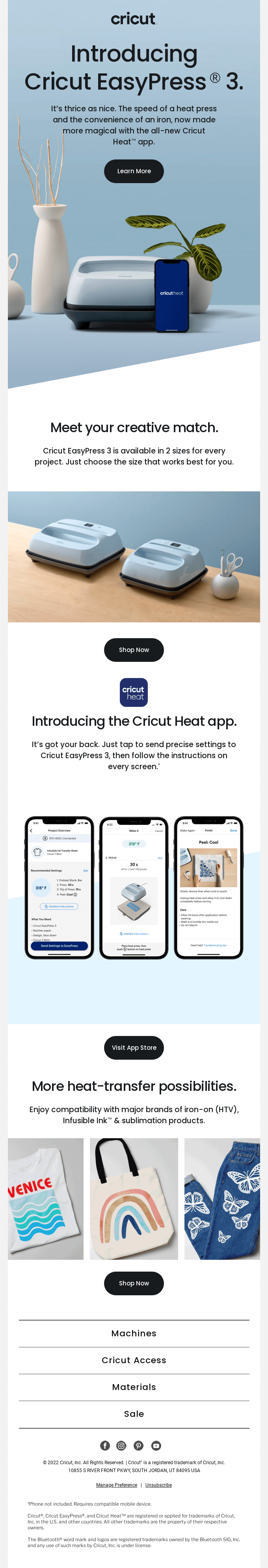
Be Careful With Images
As much as you love adding images because they electrify your campaigns, also keep in mind that they are blocked by default by the majority of mobile email clients out there. Therefore, the success of your emails, in part, is determined by how judicious you are with your pictures. At the outset, ensure that none of your images are conveying any important information. Use them to enhance the appeal of your email copy. And for all the images you are adding to your email, specify their alt texts without fail. That way, even if the image gets disabled by the client, at least your subscribers will get to find out what the image was about. Writing descriptive alt texts is ideal from an accessibility perspective too. Screen readers rely on them to interpret images for their users. Thus, the more vivid your alt texts, the greater the clarity with which your images (and your emails) will be interpreted.
Never compromise with the quality of your images for that can significantly hamper your subscriber’s user experience. At the same time, remember that high-quality images can increase the file size of your email and subsequently, its loading time. So, make sure you optimize them before attaching. Avoid using excessive images in your email; this will instantly trigger spam filters and put you at the risk of getting blocklisted. The best course of action is to abide by the 80-20 rule- 80% text and 20% images.
Optimize Your Subject Lines and Preheader Texts
Subject lines and preheaders offer a sneak peek into your email and if they are not enticing enough they will never be able to convince subscribers to open your emails. Apart from being compelling, they must be of the ideal length as well otherwise they will get clipped on a mobile screen. Experts reckon that the ideal subject line length ranges between 25-30 characters while the sweet spot for preheader texts lies between 40-50 characters. That’s roughly about 5-7 words. Well, you’ve got your work cut out for you.
Make Your Fonts Large
How many times have you stopped reading an article midway on your smartphone simply because the font was impossibly small, forcing you to squint hard and giving you an infuriating headache in the process? You don’t want anyone to have the same experience while reading your emails on their mobile, do you? For your mobile emails, use a font size which is 2-3 points larger than your desktop versions at the very least. General consensus recommends 22-26 px as the preferable font size for headlines and 14-16 px for the email body. While trying to improve the legibility of your emails, don’t end up implementing unnaturally large font sizes either. Doing so might get you flagged by spam filters.
Pay Attention To Your CTA (call-to-action) Button
The CTA button is where the magic happens which arguably makes it the most important element of your email. Hence, in your mobile-friendly and responsive HTML emails, the CTA must be prominent to a fault. Keep these two pointers in mind while designing your CTA.
- Make it stand out by using a color that contrasts sharply with the email background.
- Look into the fact that the button is touch-friendly. Don’t make your users tap on a small CTA button on their mobile screens; it can be quite frustrating. For best results, the dimensions of your button should be 44 px x 44 px at least.
Wrapping It Up
Email campaigns that aren’t optimized for mobile screens stand to suffer significantly in terms of their reach and visibility. We hope the best practices shared above are able to guide you when you sit down to design your future campaigns.

Author Bio
Kevin George is Head of Marketing at Email Uplers, one of the fastest growing custom email design and coding companies, and specializes in crafting professional email templates, PSD to HTML email conversion and free responsive HTML email templates in addition to providing email automation, campaign management, and data integration & migration services. He loves gadgets, bikes, jazz and eats and breathes email marketing. He enjoys sharing his insights and thoughts on email marketing best practices on his blog.
Interesting Related Article: “Five Actionable Email Marketing Tips Used by Email Marketing Pros“