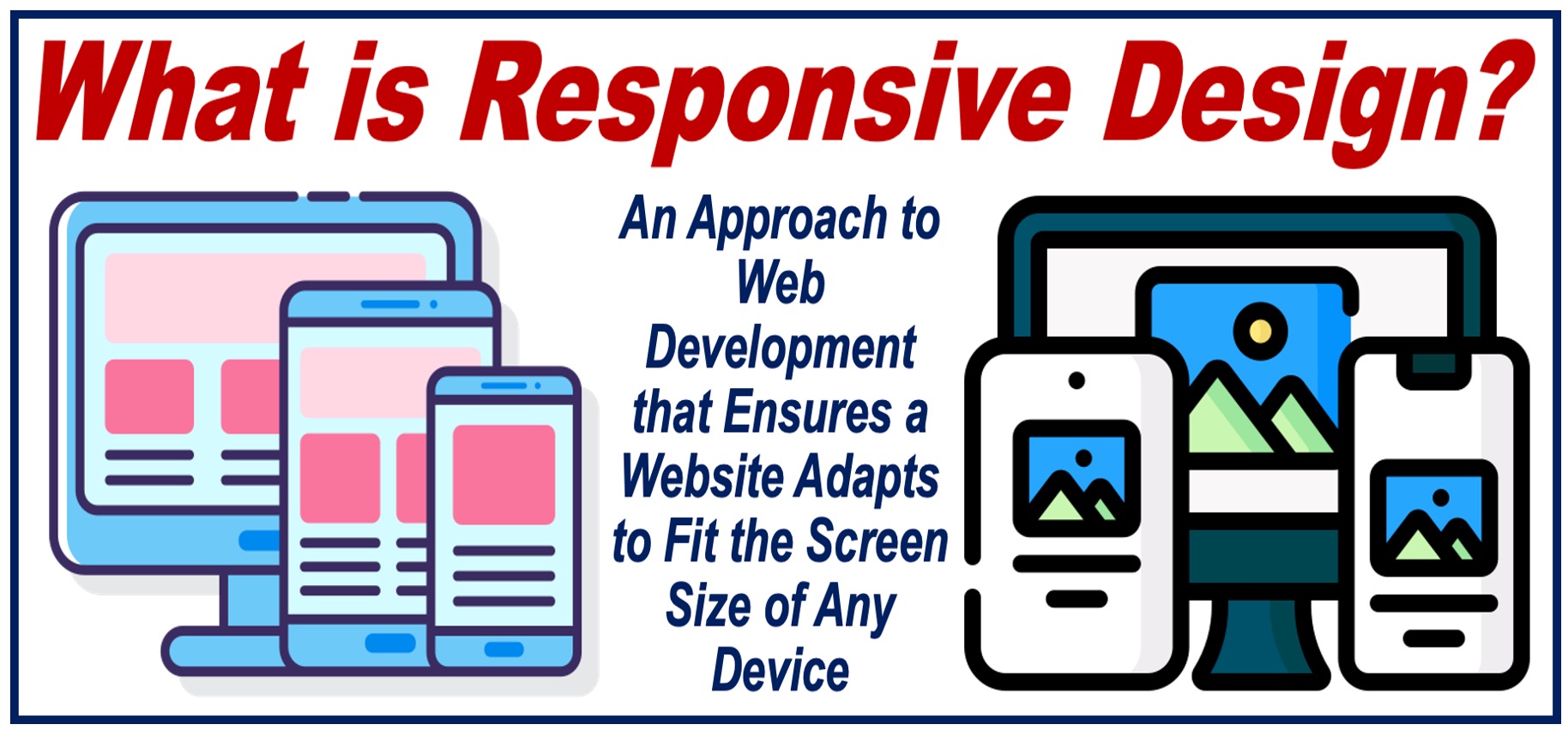
What is responsive design?
Responsive Design, also known as Responsive Web Design, is a web design and development approach that makes sure applications and websites work properly across many devices and screen sizes. It involves designing digital content that seamlessly adapts to different devices, including smartphones, tablets, computers, and even TV screens.
This approach not only enhances accessibility but also significantly improves a site’s SEO performance, as search engines favor websites that provide a good user experience on both mobile and desktop platforms. SEO stands for Search Engine Optimization.
Wikipedia has the following definition of the term:
“Responsive web design (RWD) or responsive design is an approach to web design that aims to make web pages render well on a variety of devices and window or screen sizes from minimum to maximum display size to ensure usability and satisfaction.”
Importance
Since there are so many devices nowadays, responsive design is crucial. It makes sure the user has a consistent and user-friendly experience across all platforms, which is essential for engaging and maintaining users.
Key Features
There are many key features to responsive design, including:
-
Fluid Grids
Layouts are based on flexible grid systems that resize based on the screen size.
-
Flexible Images and Media
Images and media items are scaled and adjusted within the grid system.
-
Media Queries
CSS techniques apply different styles depending on the characteristics of the user’s device.
Implementing
If an individual wishes to implement responsive design, it will require a strategic approach involving planning, design, and testing. Examples of this include:
- Designing with a mobile-first approach.
- Using flexible, percentage-based grids.
- Implementing scalable images and media.
- Applying CSS media queries for different devices.
Challenges of Responsive Design
- Maintaining design consistency across various devices with different screen sizes and resolutions.
- Managing load times to ensure quick access to content, especially on mobile devices with potentially slower internet connections.
- Constantly updating and optimizing the website to accommodate new device releases and varying screen dimensions.
- Ensuring that interactive elements like buttons and links are easily clickable and touch-friendly across all devices.
- Providing equally effective user navigation and experience on both desktop and mobile versions of the site.
- Balancing high-quality visuals with performance to prevent heavy images and videos from slowing down the site.
- Testing across multiple browsers, devices, and operating systems to guarantee a uniform experience.
- Adapting content layout without compromising the message or functionality as the viewport changes.
Overcoming these challenges is critical for ensuring a seamless and enjoyable user experience across all types of devices.
The Future
The future of responsive design is set to be revolutionary, blending AI and machine learning to tailor adaptive user experiences. Voice interfaces and IoT integration will refine interaction, ensuring seamless digital experiences across devices and environments.
Video – What is Responsive Design?
This educational video, from our sister channel on YouTube – Marketing Business Network, explains what ‘Responsive Design’ is using simple and easy-to-understand language and examples.
Written by Nicolas Perez Diaz