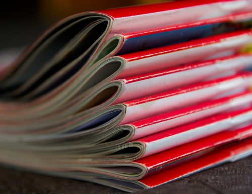
A brochure is a slim book or magazine that describes an organization, product, or service. It typically contains pictures interspersed with short pieces of text. Put simply, a brochure sits between a leaflet and a catalogue.
Companies use brochures to raise awareness, engage interest, and sell. Brochures are an opportunity not just to sell wares, but also to introduce the firm and what it stands for.
In some industries, the brochure has enough information for the reader to make a purchase decision.
Chain stores, for example, mail out brochures about special promotions. These can look like slim catalogues. They contain photographs, brief descriptions, and prices about the products in the promotion.
In other industries, firms used brochures as a way to help clients who may just want to browse. Sending out a brochure also presents an opportunity to follow up.
Before the internet, the paper brochure was often the main way for prospective buyers to find out about firms and their products and services.
Nowadays, the online brochure offers many ways to present information. However, the same principles apply.
 A brochure is a slim volume that lies somewhere between a leaflet and a catalogue.
Image: pixabay
Some things to think about when producing a brochure
Presentation: Think pictures first, text second; imagine the layout by placing the pictures first, and then the text. Choose simple, classic fonts and go easy on underlining, bold, and italics.
Accuracy and quality: The brochure is an opportunity to make a good first impression. A spelling mistake or incorrect information may imply carelessness in your business.
Purpose: What is the purpose of your brochure? Ask yourself, “What do I want the reader to do next?” If you want them to call you, then is your number clearly displayed?
Target audience: Who is the reader? Too many people design brochures for themselves. They say “I like that!” but don’t ask “will my readers like it?”
Conduct a trial: Make samples and get feedback. Ask open and specific questions from a representative audience. An open question might be, “choose three words that best describe your feelings about this brochure.”
Keep it simple: Brochures are not the place for dense text and detailed, annotated pictures. A brochure conveys indicative, not exhaustive, information. Detail belongs in the catalogue or separate inserts.
Usage: How do you intend to use the brochure? Is it for sending out in response to an advertisement or query? Are you handing it out at an exhibition or presentation?
Fit with other documentation: Where does the brochure belong in your suite of sales or company literature? How does it fit with your website? Avoid giving long detailed links to webpages. Consider using keywords in the brochure and having a good search tool on the site.
Some of the tips on designing an informational booklet may also apply.
Example from the travel industry
When the internet came along, there was a feeling in the travel industry that it would kill the paper brochure.
However, it appears that the paper brochure has undergone a revival. This has entailed a shift in focus. Gone are the destination descriptions, travel itineraries, and pricing options.
Instead, many of today’s travel brochures are more like glossy travel magazines. The content is big on inspiring photographs, colourful features, and travel tips.
Prices are nowhere to be seen. If people want to know how much the dream costs, they can always look it up on the website.
