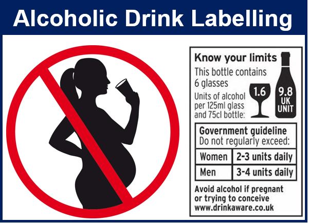
Alcoholic drinks companies that committed to the Public Health Responsibility Deal in the UK, are not fully meeting their pledge regarding labelling, researchers from the London School of Hygiene & Tropical Medicine reported in the journal Addiction.
Compared to other products with health effects, the alcohol industry’s labelling information often falls short of best practice, with much smaller fonts and logos.
In 2011, a public-private partnership among voluntary organizations, public bodies, the government and industry signed up to the UK Public Health Responsibility Deal. Those involved made voluntary pledges designed to improve public health.
 Wine labels tended to have smaller pregnancy logos than beer and cider labels.
The alcohol labelling pledge was signed by more than 100 organizations, promising to “ensure that over 80% of products on shelf will have labels with clear unit content, NHS guidelines and a warning about drinking when pregnant.”
The signatories pledged to include the following information in their labelling:
– How many units a drink contained,
– the Chief Medical officers’ daily guidelines for lower-risk consumption, and
– a warning about the health risks of drinking while pregnant.
Labelling often small and unclear
According to the Deal, this information should be legible, clear, displayed on the primary packaging, and easy for consumers to find. The guidelines encourage companies to use a font size that is at least the same size as that used for the main body of information.
In this study, the researchers examined the labelling on the UK’s 100 top-selling alcohol brands.
The first three (required) elements were detected on just 77.6% of products examined. The Chief Medical Officers’ unit guidelines had a mean font size of 8.17, while the mean size of pregnancy logos was 5.95mm.
Guidelines for packaging inserts for medications suggests a minimum font size of 9 to 12.
The researchers found that overall, alcoholic drink labels often fell short of best practice, with poor clarity and legibility a particular problem.
Pregnancy logos deliberately smaller on wine labels?
What the authors described as a particularly concerning finding, were the size of the pregnancy logos in wine bottles – they were much smaller than on containers of beer, lager or cider (5.1mm vs. 7.1mm). In the UK, women are more likely to consume wine, while beer is more popular among males.
Lead author Professor Mark Petticrew said:
“Alcohol labelling can help consumers make an informed choice about health risks and about consumption, so it is important that it is clear and legible. Our findings suggest that this is very often not the case.”
In an Abstract in the journal, the authors concluded:
“The UK Public Health Responsibility Deal alcohol labelling pledge has not been fully met. Labelling information frequently falls short of best practice, with font and logos smaller than would be accepted on other products with health effects.”
Citation: “Health information on alcoholic beverage containers: has the alcohol industry’s pledge in England to improve labelling been met?“ Mark Petticrew, Nick Douglas, Cécile Knai, Mary Alison Durand, Elizabeth Eastmure and Nicholas Mays. Addiction. DOI: 10.1111/add.13094.
Video – The Public Health Responsibility Deal
In this video, Brian Dobson, Chair of the Drug Education Forum, talks about his experience in being part of the government’s public health responsibility deal, which has been looking at what retailers and producers of alcoholic drinks could do to improve alcohol education for young people.
