 Every business worth its salt certainly has a website, and if you have a business which already has a website, but it doesn’t seem to be working for you, then you may want to have it redesigned.
However, great website design isn’t just about having an attractive style and layout – it’s also about picking the right elements and making sure they go well together, and it’s about keeping it all as balanced as possible. This is easier said than done, right? But it is entirely possible to have excellent website design as long as you keep a few key principles in mind. Here, then, is a look at the top principles for the best website design.
-
Keep it balanced
When it comes to balance, think about making sure that your website design doesn’t emphasise one side and then ignore the other. It’s all about having symmetry, especially in regard to your layout. When thinking about the layout of your website, you can manipulate the various visual aspects with the proper use of size, colour, and the removal (or addition) of various elements.
Achieving the right balance isn’t easy, however, and this is where a professional eye and the proper web design services will definitely come in handy, as they know how to achieve the right balance and give your website the right symmetry.
-
Don’t forget the grids
Here’s an easier way to achieve the right website design: don’t forget the grids. When you use grids for your website, it helps you get the balance you need as well, and it enables you to compartmentalise your website, so it is easier to read and understand.
You can use either vertical or horizontal grids or rulers, and they can vastly improve your site’s readability, not to mention making your content much easier to take in and absorb. Spacing is also essential, and this is where the Golden Ratio also comes in. The Golden Ratio accounts for the use of sidebars, which are often one-third of the page’s width, and why a website’s main content is usually equal to the width of the design divided by the number 1.62 (which equals phi).
-
Limit your main colour choices to two or three
Whilst you may already know that colour can do a lot for your website, it doesn’t mean that you can go all out and go berserk with your choices in colour. In fact, it’s best to limit your main or base colour choices to two or three.
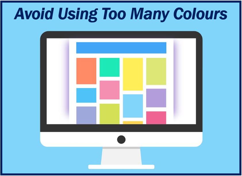
Keep the colour palette in mind so you can choose colours which complement each other rather than oppose each other. You can either go for monochrome colours or contrasting colours, but the point is to make sure that the colours instinctively feel good on your site and look good for you.
Perhaps one of the most lucrative things you can do for your site is to choose two to three main or base colours, and then make use of tints (lighter colours which are mixed with the colour white) as well as shades (darker colours mixed with the colour black) if you need to expand your colour palette.
-
Know your graphics
Whilst it’s true that great website design doesn’t need a lot of fancy, bold graphics, it’s also true that poorly chosen graphics can have a negative impact on your design. Graphics, after all, will add to your website’s visual appeal and message. With graphics, you can either go subtle or advanced, but you also have to be sure that the graphics you choose complement each other. Sometimes it’s all about the gut feeling as well. Good luck!
________________________________
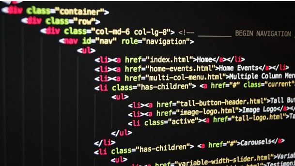
Interesting related article: “What is HTML?“