Your website is the anchor to your business success. Any reputed marketing agency will emphasize the importance of having a search engine-optimized website that carries high-quality, engaging content and provides a top-notch user experience! With millions and millions of websites clamoring for attention, the user experience may be the most important determining factor for ensuring conversions. We look at some simple yet effective tips any service for SEO would suggest for enhancing user experience.
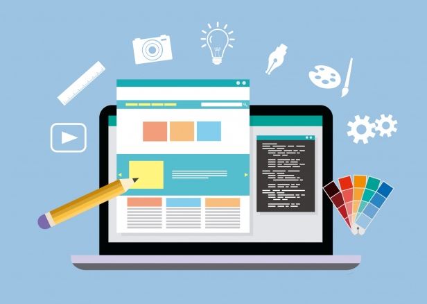
Improving Upon Website User Experience
Some tips for improving upon website user experience include:
- Speed is a winner: When it comes to the load time of the web page, speed is necessary. Every second counts and the perfect load time for any web page is about 1 to 2 seconds! Anything more than that can be perceived as a lag. With the load time increasing beyond 3 seconds, the bounce rate increases. Whereas the rate is about 9% at a load time of 2 seconds it can increase to about 38% at about 5 seconds! Keeping the speed up always helps.
- Being Conventional is Good: When it comes to website designing, being conventional on some parameters is good. Although accommodating innovative trends isn’t bad, the conventions should be maintained at key places to enhance user-friendliness. For instance, there must be standard conventions for logo placement, navigation bar placement, contact information, and so on. The idea is to make the website visit easy and convenient for the user and not to confuse him.
- Links should Appear as Links: Every web page aims to get the user to create some action, and hyperlinks are the most suitable tool in this department. However, as any user experience specialist will tell you, hyperlinks are likely to be clicked and explored only when they look like links. Usually, links appear underlined and in blue color. In addition, links containing more words will work better than shorter links. Make sure they stand out.
- Allowing Designs to Breathe: Designs require empty spaces to breathe. When your design is inter-spaced with white spaces, it appears legible, readable, and simple to scan. Using white space in between designs enhances user attention by about 20%! Spacing out designs also makes the website appear elegant. However, maintaining a balance between white space and design elements is important. Too much white space can be frustrating, too!
- Organizing content into bullets: We all want to find information easily. And bullet points are a great way to provide that. Breaking the content into bullets helps readers in finding crucial information easily. Text-filled paragraphs or stanzas are huge put-offs, especially when users always look for quick fixes! This is why bullets appeal to readers more. They are easy to read and dig into to fish out essential information.
Interesting Related Article: “Grow Your Business Website with Best Elementor Widgets & Templates“