
Microsoft is redesigning its Skype messenger service, removing many Snapchat-like features which users complained overcomplicated the app.
The company said that the updates it made to the Skype application over the past year, which included a design overhaul and the addition of its own version of “stories” called Highlights, “didn’t resonate” with most users.
In an official blog post the Skype team said that it has been working closely with customers to make its application easier to use and provide a better experience.
Skype design director Peter Skillman said: “This past year we explored some design changes and heard from customers that we overcomplicated some of our core scenarios. Calling became harder to execute and Highlights didn’t resonate with a majority of users. We needed to take a step back and simplify!”
We’ve made some updates to Skype. It’s simple and familiar just the way you like it! https://t.co/Zj156qeAkq pic.twitter.com/gIygFiuViX
— Skype (@Skype) August 31, 2018
What is being changed?
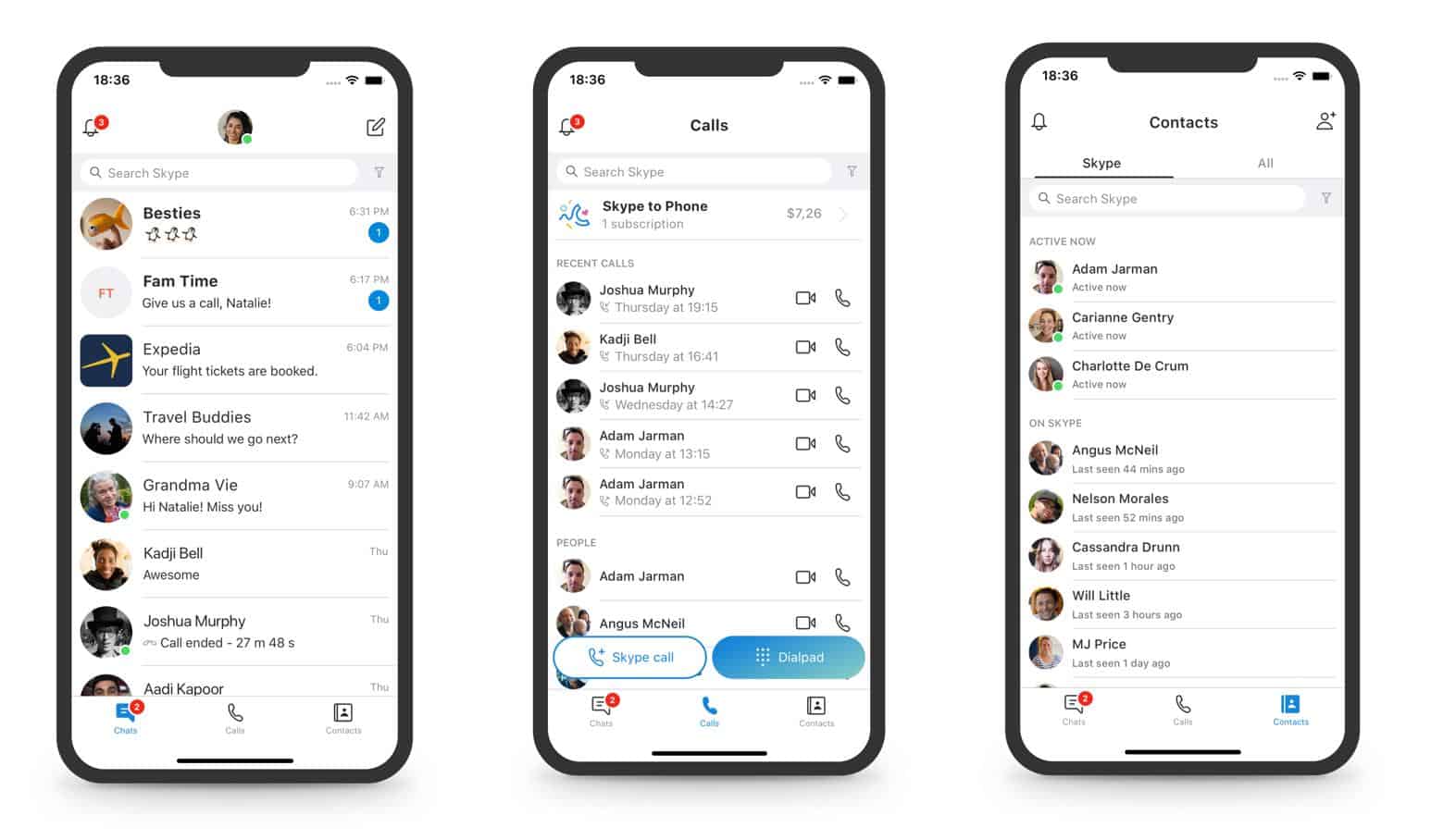
- The navigation model is being changed to remove “redundant and underused features”, minimizing clutter.
- The mobile app will only have three buttons at the bottom – Chats, Contacts, and Calls. Highlights and Capture are being removed.
- The desktop app will have the buttons for Chats, Calls, Contacts, and Notifications on the top left of the window.
- The visual range of the gradients is being toned down.
- The option to use a simplified Skype “Classic” blue theme.

“This is only the beginning and you can expect many more updates over the next several months as we continue to simplify and improve the core experiences around calling, chat, and contacts,” Skillman added.
Skype was released in 2003 and acquired by Microsoft in 2011.
The application is available for Android, iOS, OS X, Linux, and Windows 7, 8 & 8.1 operating systems.